A NEW IDENTITY FIT FOR A KING.
Revitalizing the path to purchase for an American icon.
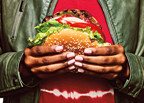
For more than 20 years, it was business as usual at Burger King. That all changed in 2020. The King needed an updated look from head to toe that represented its legacy but also introduced a new emphasis on quality. Everything from the brand’s logo to merchandising, restaurant décor and menus got the royal treatment, leveraging vibrantly bold colors, a new “Flame” font, updated uniforms and revamped packaging. Rolling out the rebrand at every touchpoint was a massive undertaking that ultimately delivered on the brand’s promise of a vastly improved guest experience.
Service
Print, Digital, Photography, On-Premise Merchandising, Social Media, Branding
Client
Burger King


Summary
Even the most jaw-dropping creative Visual Identity depends on when and where it is seen. A brand doesn’t exist in a museum–it’s out in the streets with the people. Successfully rolling out BK’s retro yet modern aesthetic and food-forward story across every conceivable touchpoint fell on us. We developed nearly 400 brand assets, each one strategically and creatively adapted to fit into every step of the consumer journey.


