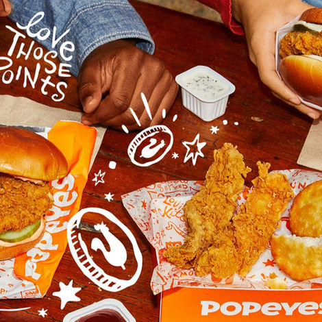
FROM LOUISIANA WITH LOVE.
Path-to-purchase expertise introduces consumers to a new look for Popeyes.
Popeyes is known for 12-hour marinated chicken. But when it came to branding, they hadn’t cooked up anything new in years. Although the brand’s heritage had built a passionately devoted following, they weren’t winning new, younger customers. The solution was an updated visual identity that cleverly infused new elements into their tried-and-true branding. This included new fonts; “Chicken Sans” and "Chicken Script", a new iconic character named Poppy, and original illustrations paying homage to the brand’s Louisiana roots. It was up to us to help this bird fly the coop and meet the world.
Service
On-Premise Merchandising, Branding, Packaging, Print, Photography, Social Media, Digital
Client
Popeyes


Summary
Popeyes became synonymous with THE Chicken Sandwich. But tied to that product launch was something much bigger: the roll-out of a brand-new visual identity. The key to the success of both was in the timing. Once we grabbed the attention of the entire planet, we kept the brand in the spotlight with a blitz of creative. Website rebranding, packaging to an all-new loyalty program, we developed assets for every consumer touchpoint. The result was juicy creative that owned the competitive landscape.


